Case study
Streamlining Certification: A Mobile-First Learning Journey
Redesigned a global certification platform to simplify learning and boost completion rates.
TL;DR
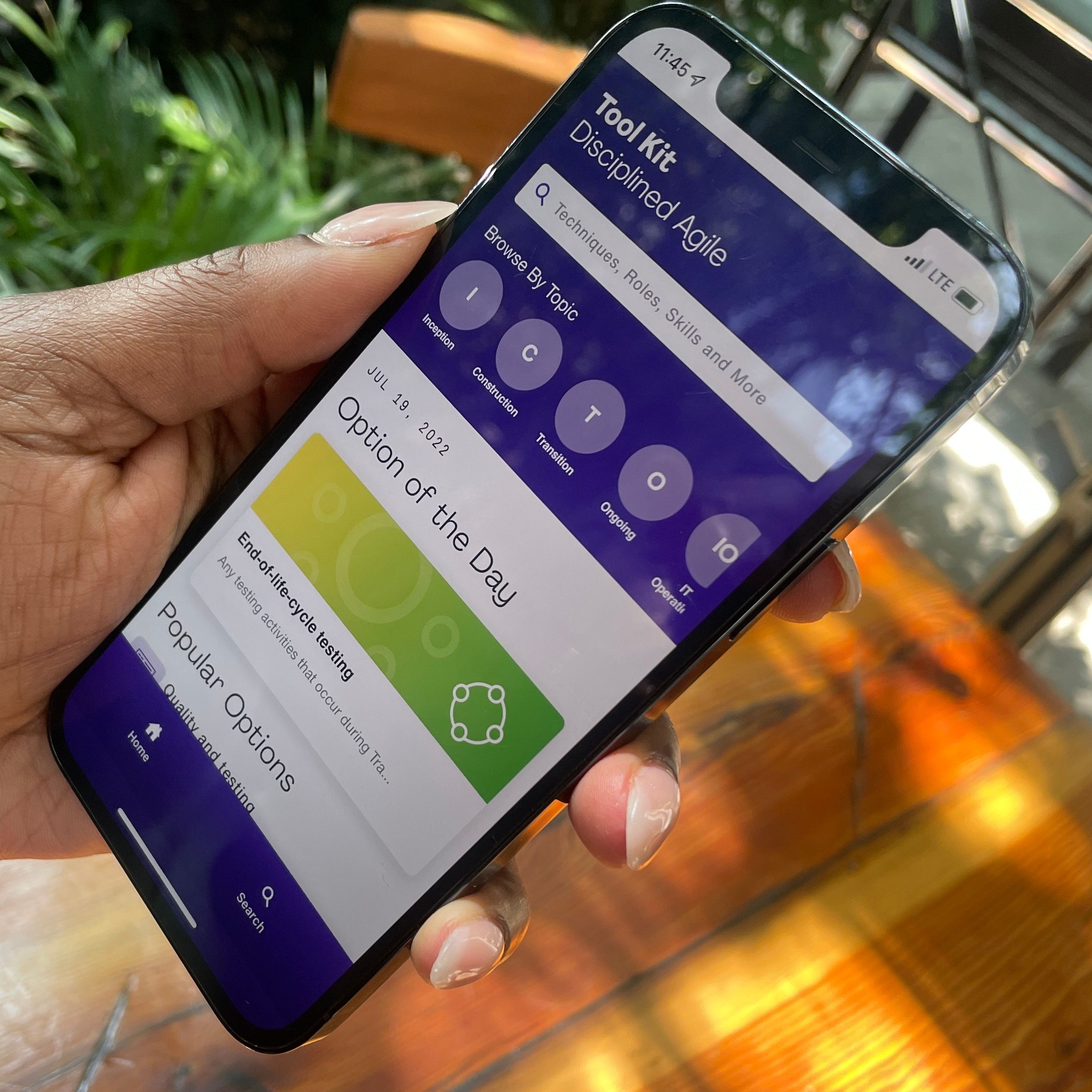
Led the redesign of a certification experience platform, turning a fragmented process into a guided, mobile-first journey.
Overview
A global certification body served over 250,000 learners but its digital experience was fragmented, leaving users frustrated and support teams overwhelmed. I led the UX overhaul to deliver a cohesive, guided certification journey.
Challenge
No clear guidance
Learners didn’t know where to start.
High drop-offs
40% of users abandoned midway.
Disconnected systems
Frustrating system switching.
Low trust
International learners were unsure of the right path.
Solution
We redesigned the experience with:
- Unified certification pathways
- Guided dashboards and visual progress tracking
- Embedded contextual support
- Fully mobile-responsive design
Research & Insights
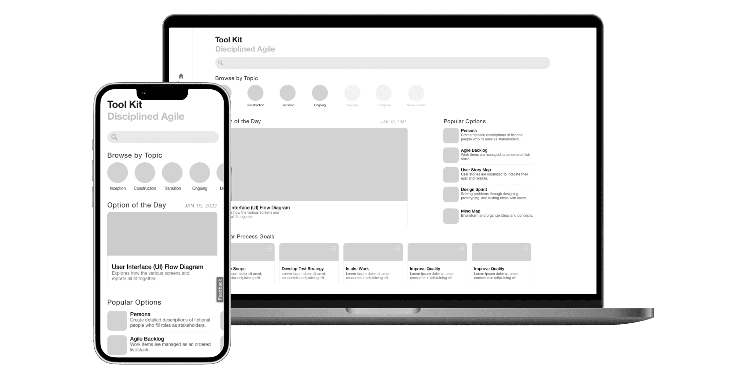
Our research focused on how working professionals engage with professional development platforms and where certification journeys break.
Methods:
- In-depth interviews and usability testing with 37 platform users
- Analysis of learning analytics from 500+ sessions and heatmap tracking
- Survey responses from 100+ global learners and support ticket review
Findings from that work:
- 72% of learning attempts occurred outside work hours, with 64% on mobile devices
- Navigation confusion caused 45% of support tickets and increased completion time by 2.5 months
- Multi-certification learners had 2.3x higher drop-off rates due to unclear pathways
What we heard in research
I had no idea where to start. It felt like I had to figure it out on my own.
I just wanted a roadmap: where I am now, what’s next, and how far I’ve come.
This new platform is exactly what I needed—everything is clear now, and it feels so much easier to keep going.

Design Decisions
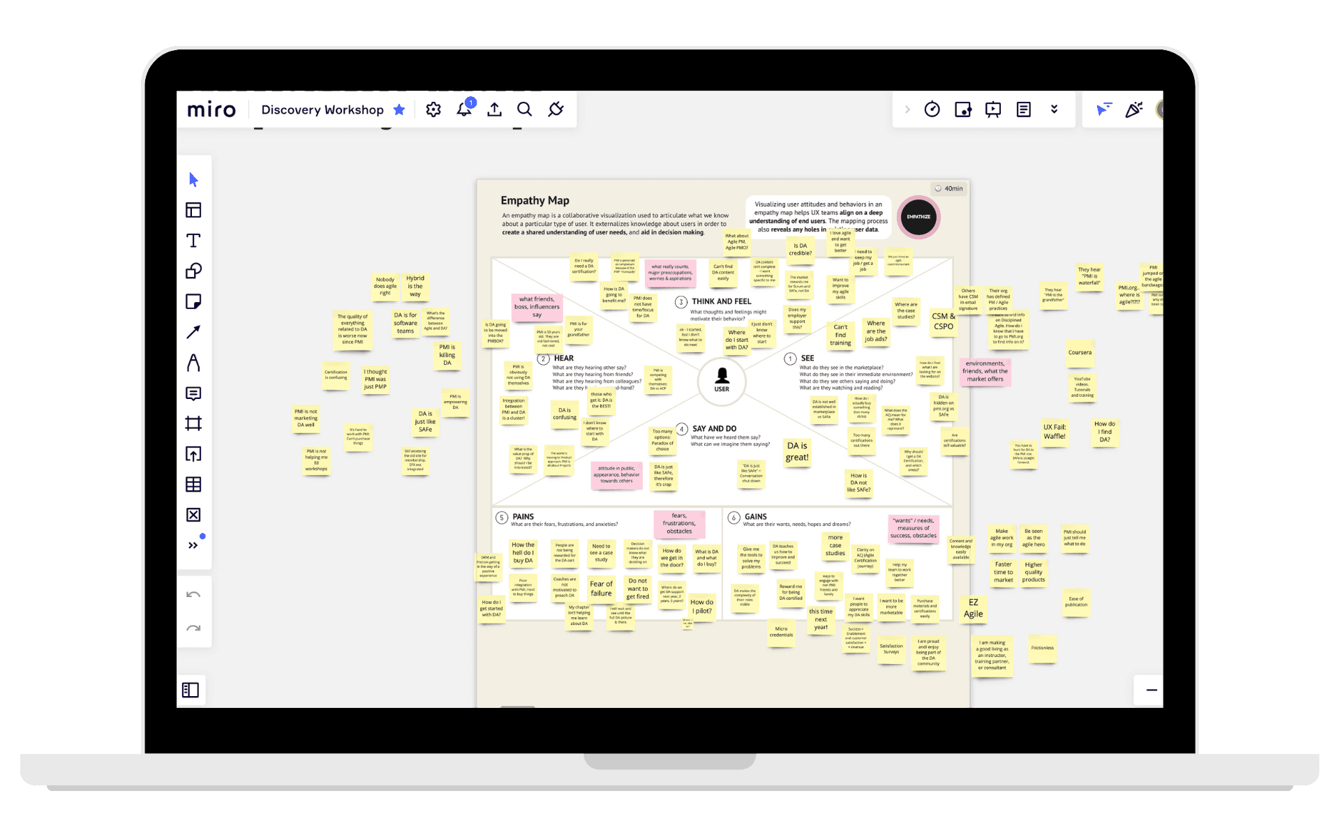
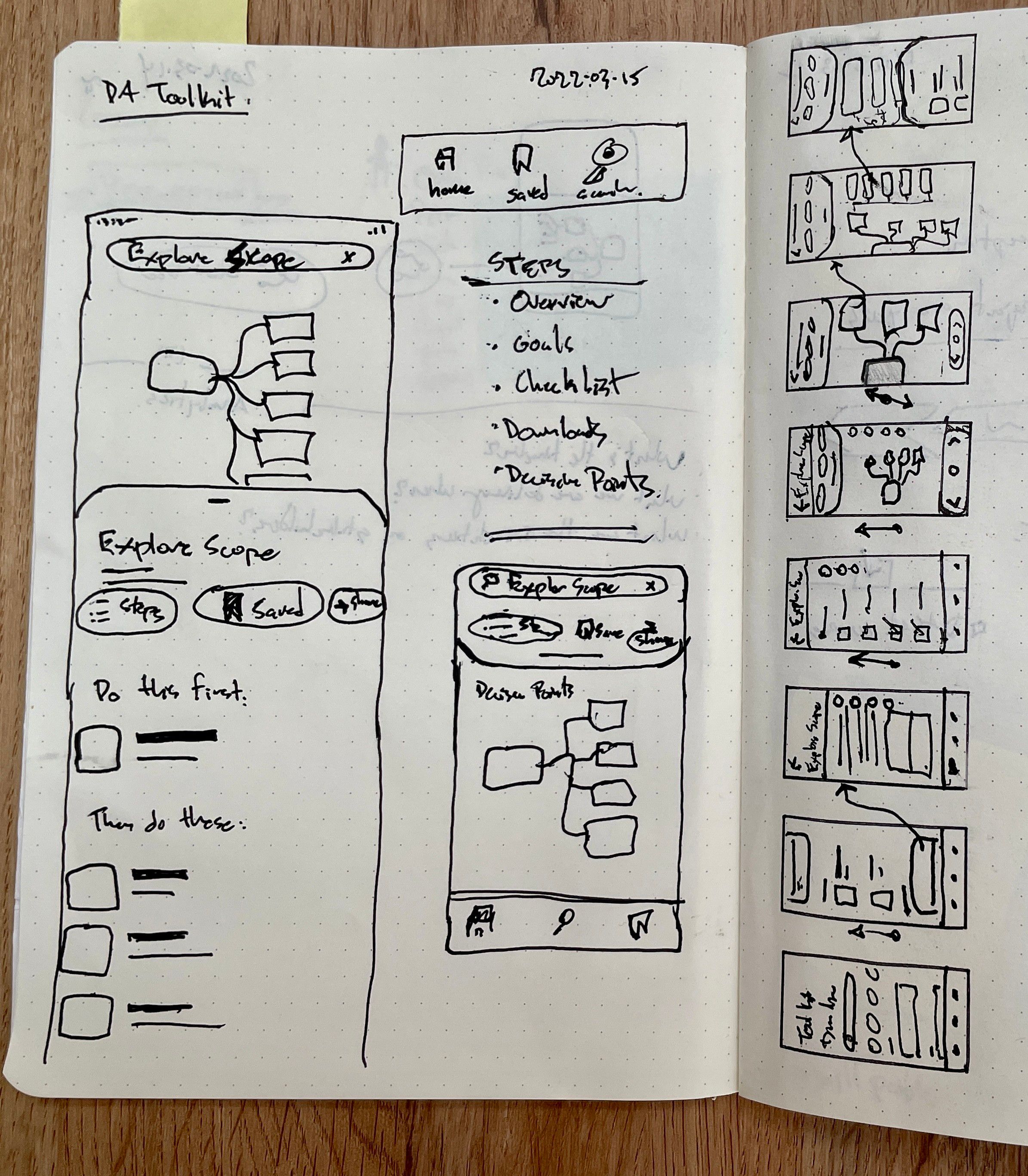
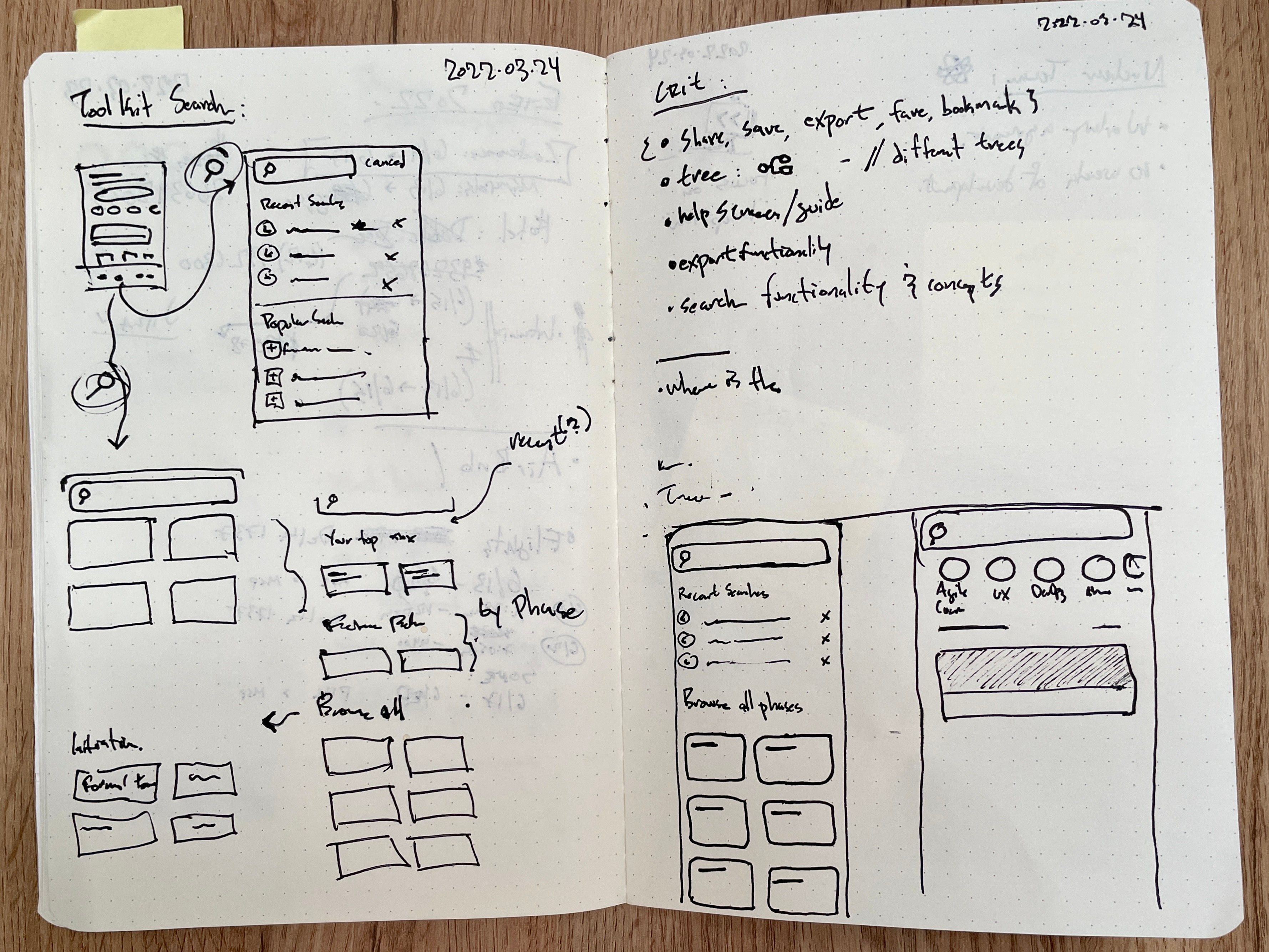
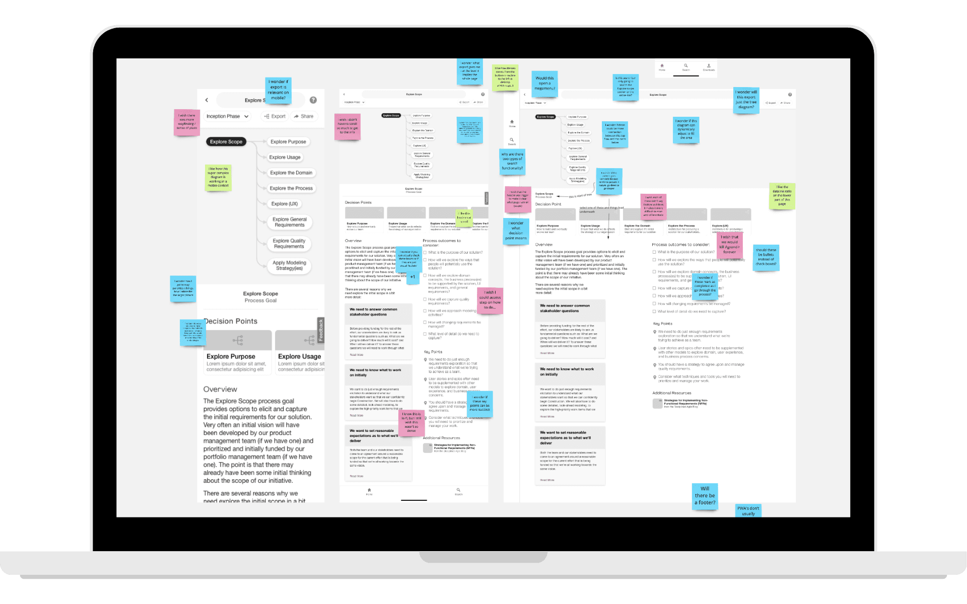
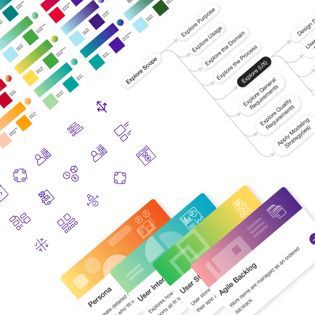
A look at the key design moves that clarified complex flows and improved learner confidence.
Mapped workflow: Discovery → Sign Up → Enrollment → Exam → Credentialing
Key UX decisions:
- Unified dashboard
- Visual journey map
- Contextual tooltips and guidance
- Mobile-first layouts
Iterated to simplify language, highlight milestones, and optimize the dashboard.
Outcome
Learners finally had a clear path from discovery to credentialing. Unified pathways, guided dashboards with visual progress tracking, and embedded help replaced the system-switching, so people knew where to start and what came next.
The work delivered $2.8M in impact, 18% fewer support tickets, 23% faster certification, and a +12 lift in satisfaction.
Reflection
Clear guidance and embedded help boosted user confidence and outcomes. Earlier international user testing would have strengthened localization.