
Case study
Taking Field Dispatch Off Paper
A mobile-first dispatch system that replaced paper workflows with real-time tools for technicians and dispatchers.
TL;DR
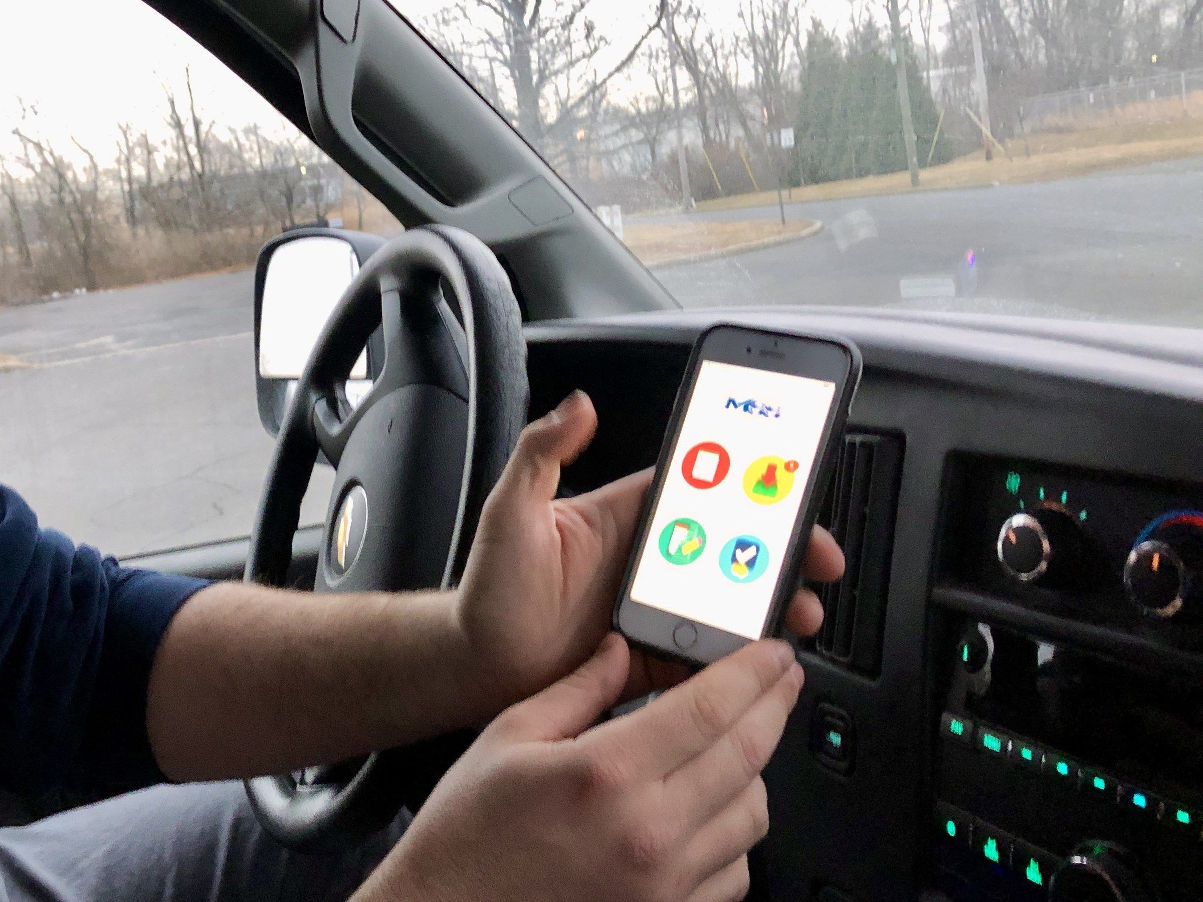
Led the UX design of a mobile-first dispatch platform that replaced paper schedules, Excel, and PDF forms with a real-time system for technicians and dispatchers.
Overview
A nationwide logistics company was coordinating over 100,000 specialized moves annually using paper schedules, Excel sheets, and PDF forms. Technicians in the field lacked a cohesive digital tool, leading to inefficiencies and miscommunication across teams.
I led the UX design of a mobile-first dispatch platform that modernized operations, offering real-time visibility and intuitive tools tailored for technicians and dispatchers.
Challenge
Paperwork overload
Manual job tracking increased error rates.
No real-time updates
Dispatchers lacked visibility into field progress.
Poor usability
Tools weren’t optimized for mobile use in the field.
Solution
We built a digital dispatch platform optimized for field use and HQ monitoring, with:
- Centralized job information and status tracking
- Offline functionality and mobile-first design
- Real-time job assignment, tracking, and rerouting
Research & Insights
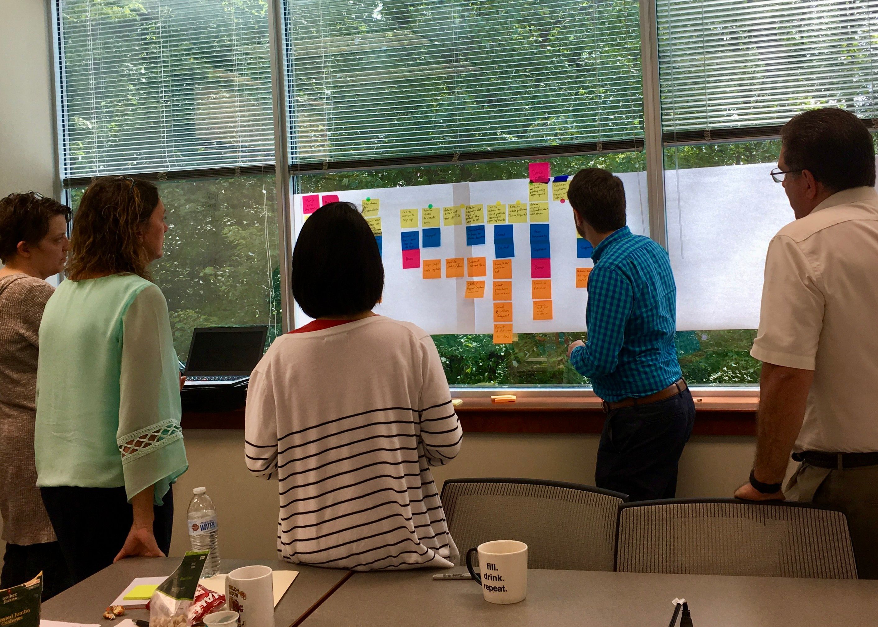
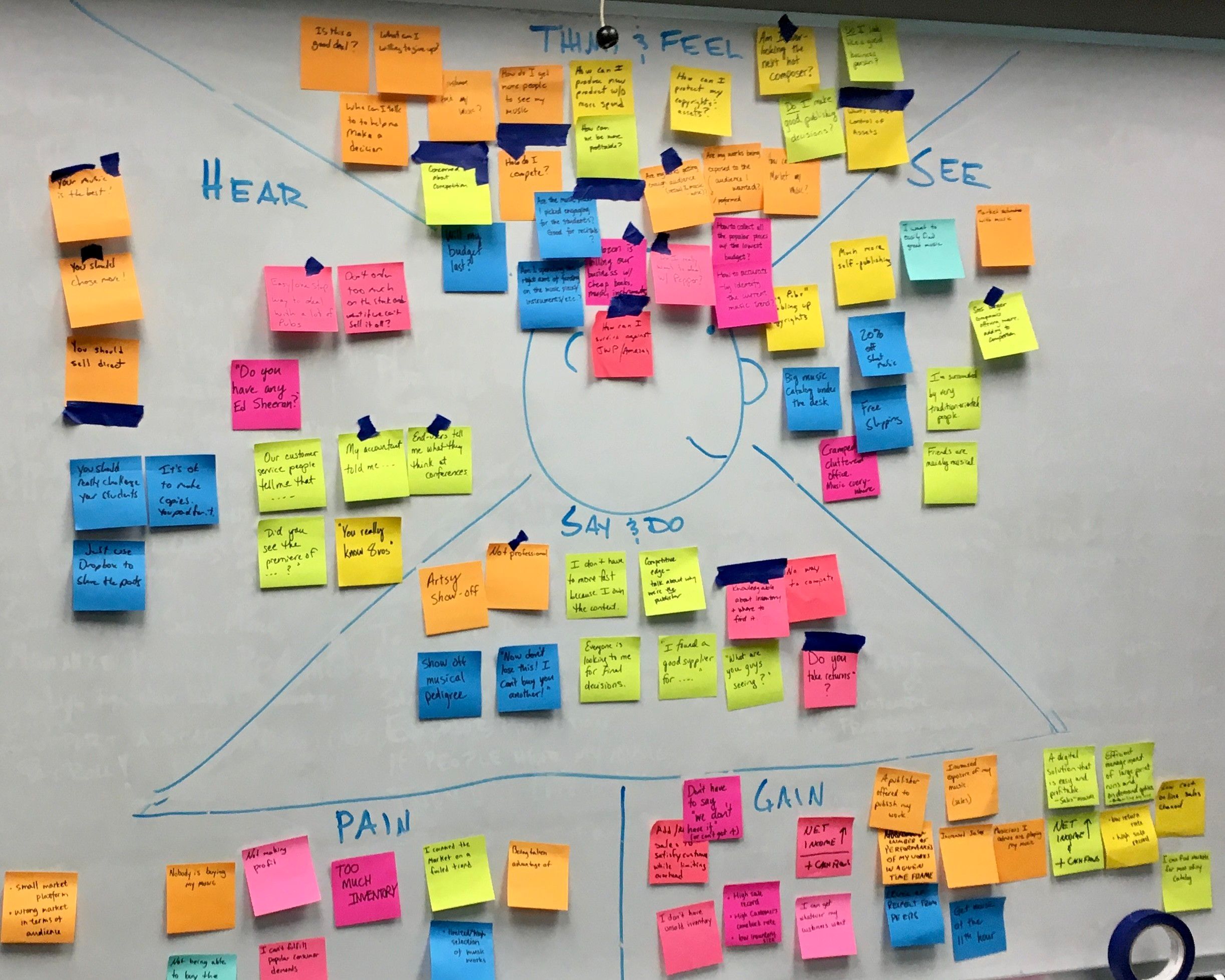
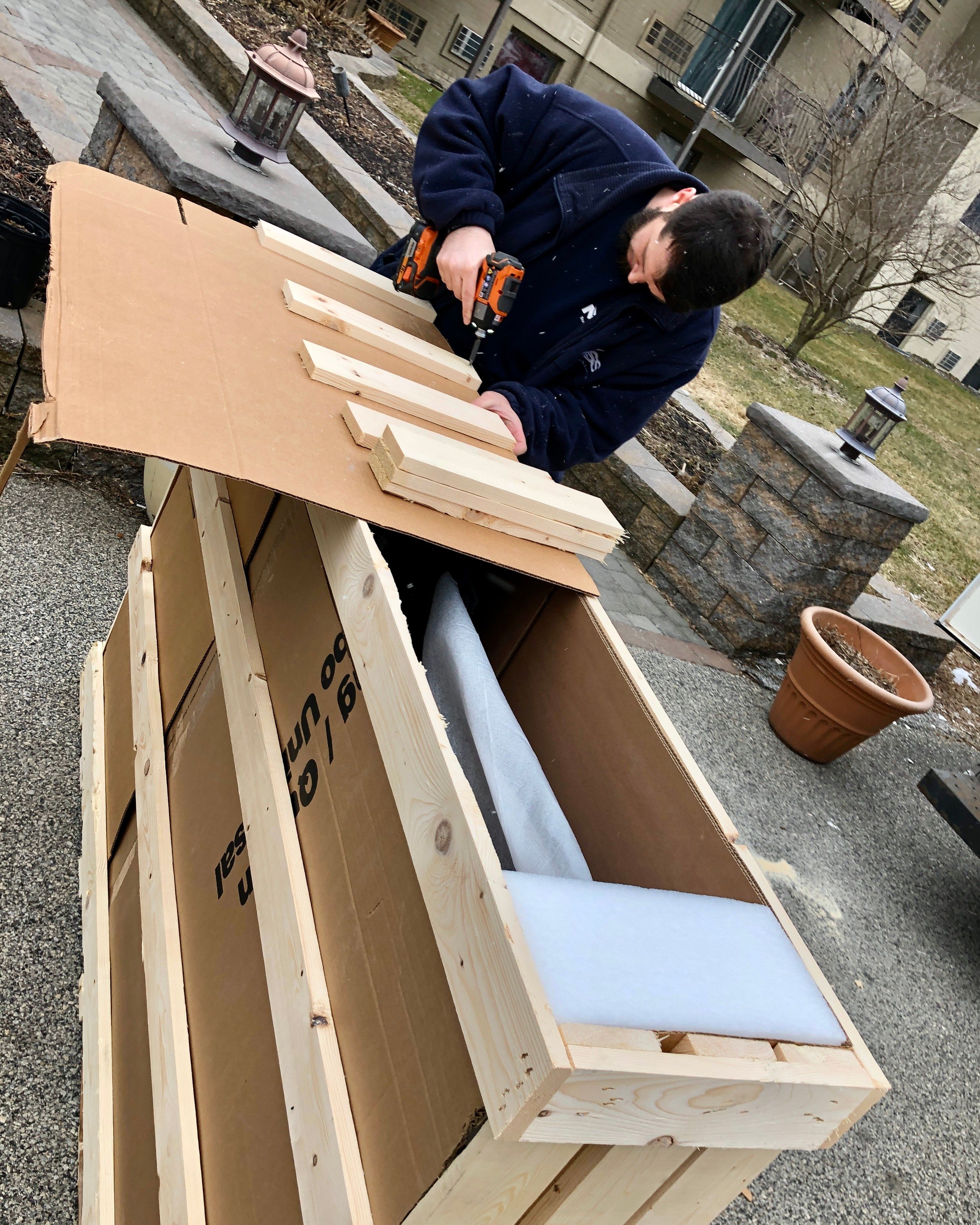
I started in the field, not in a conference room. I shadowed dispatchers, rode along with technicians, and ran more than 10 contextual interviews to see how jobs actually moved from the office to the truck and back.
Methods:
- Shadowed dispatchers and rode along with technicians
- 10+ contextual interviews
What kept coming up:
- Spotty connectivity: offline access was critical
- Simplicity first: field techs wanted less clutter and clearer visibility
- Visibility gaps: dispatchers needed real-time insights
What we heard in research
We lose track of where each tech is at during the day. Once they’re out, we’re basically blind.
I don’t need a ton of features—just my list of jobs and a quick way to mark them done.
It’s night and day from before. Dispatch is faster, and my techs are way more confident in the field.
Design Decisions
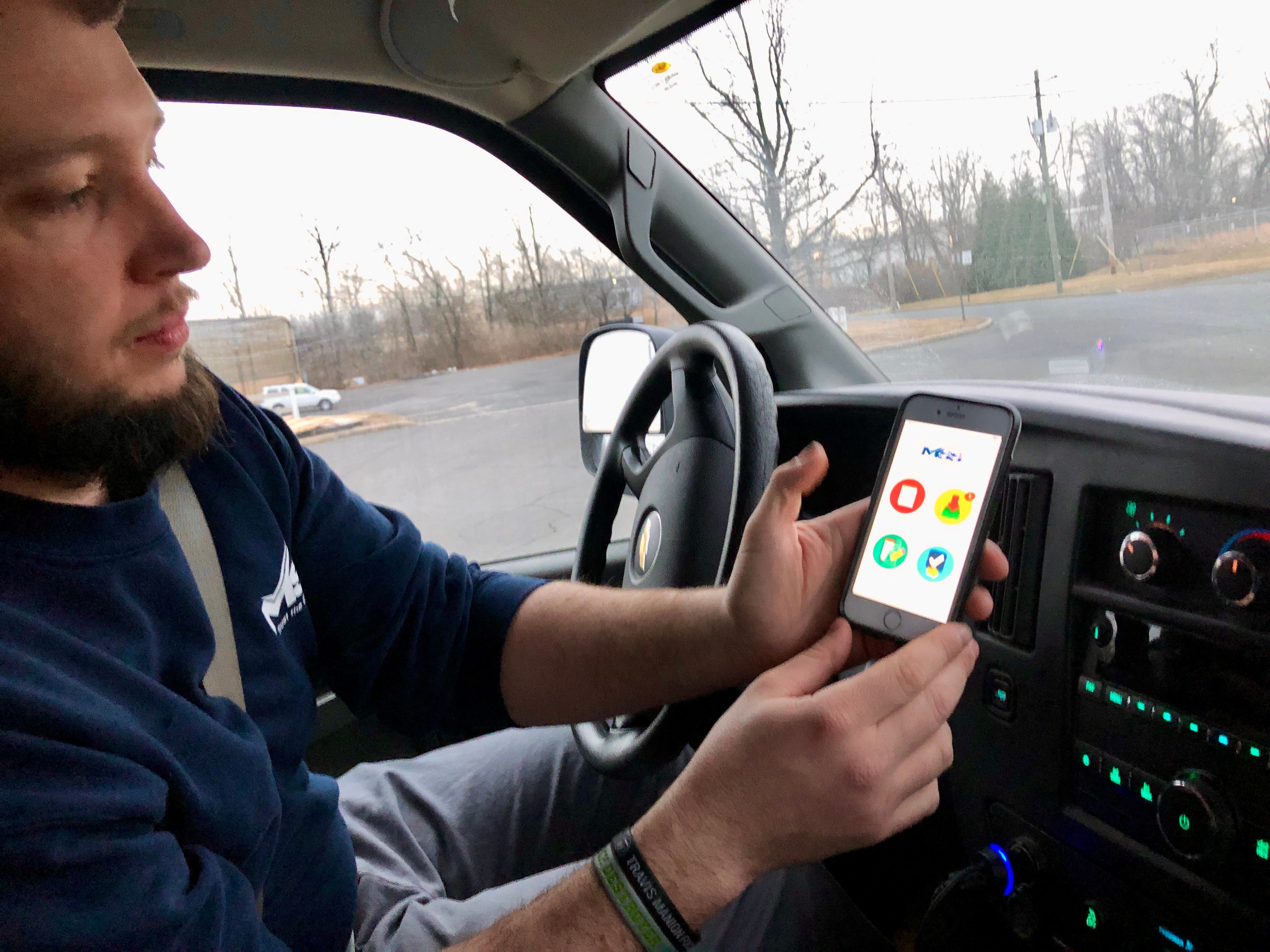
A look at the pivotal design decisions that shaped the experience, balancing real-world constraints with user needs.
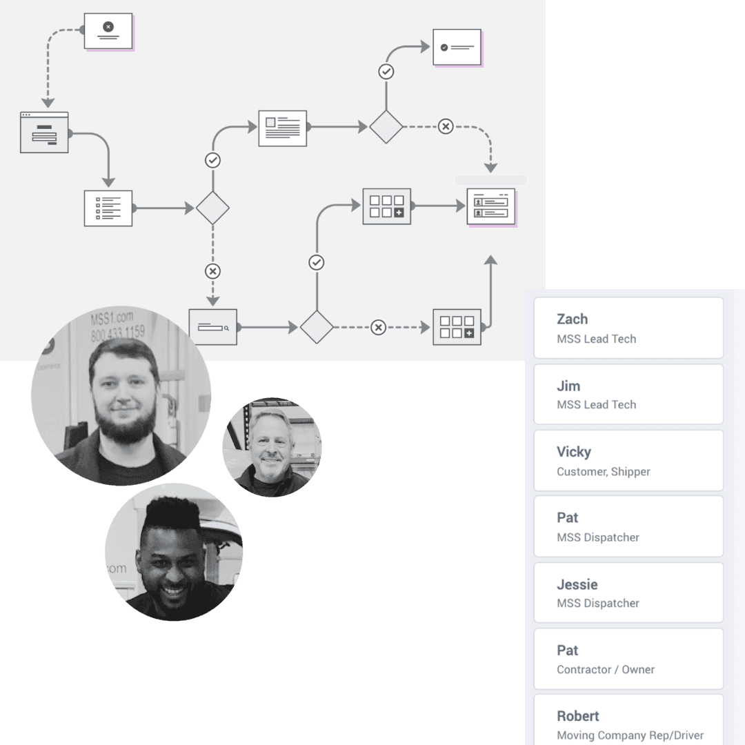
Mapped workflow: Dispatch → Technician View → Progress → Completion Sync
Key UX decisions:
- Simplified daily scheduling
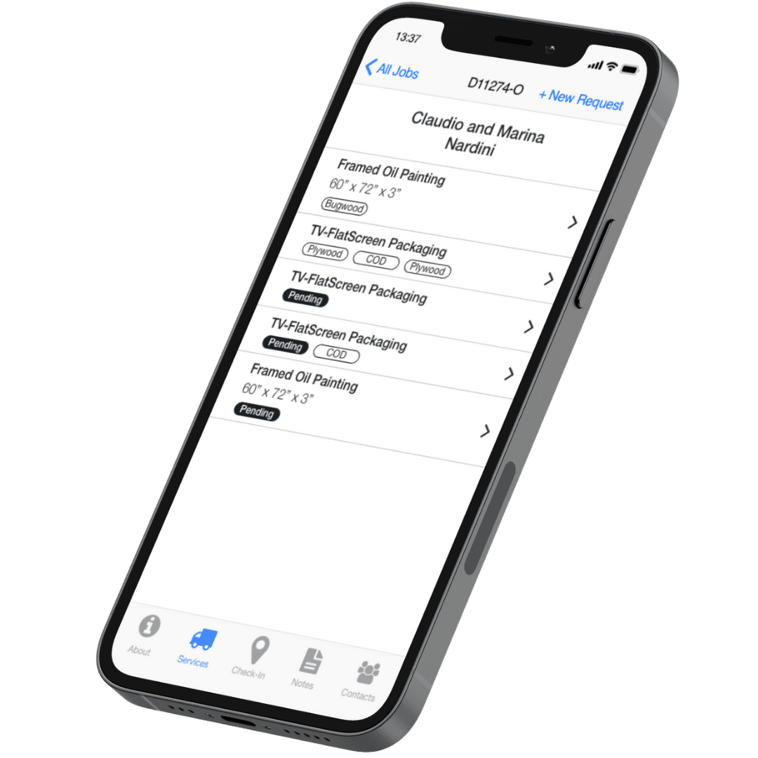
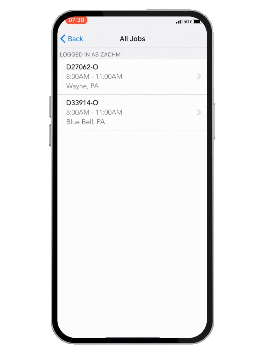
- Job cards with detailed instructions
- One-tap status updates
- Dispatcher dashboard for live monitoring
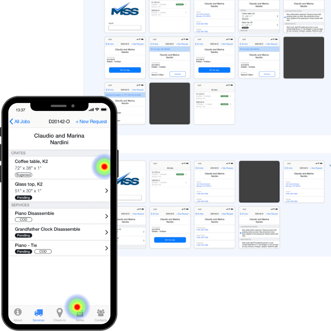
Usability tests led to offline sync, larger tap targets, and UI refinements.
Outcome
The final solution included a mobile interface for technicians to track jobs, a real-time console for dispatchers, and a modular design system built for future scalability.
Dispatch ran 47% faster and saved $2.1M. Adoption reached 95%, paper dispatching hit zero in 6 weeks, across 100K+ moves.
Reflection
Designing for real-world constraints like low connectivity and gloves-on usage was key. Prioritizing early-stage field testing was crucial for the success of the project.